


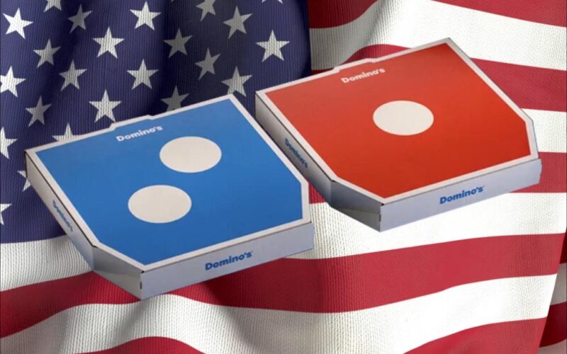
Domino’s pizza chain is changing its logo – and it’s not afraid of keeping it red, white and blue.
The pizza chain has a new box design that doubles down on its decades-old color scheme that evokes the Star Spangled Banner. This time, it does it with a blue and white box that has “Dommmino’s” on the side – with the “mmm” part in the middle highlighted in red.
The redesign is part of Domino’s first makeover in a little more than a decade, and according to some marketing experts, reflects the shift in consumer attitudes away from so-called woke themes of social justice and intersectionality to something more inclusive and wholly American.
OK, it’s not the biggest display of patriotism ever expressed by a large company. But Fox Business’s Teuta Dedvukaj interviewed marketing experts who say it’s no coincidence that the new heightened emphasis on those colors that adorn the American flag follows intense consumer backlash that afflicted brands such as Bud Light, Target, and most recently Cracker Barrel when they went woke in their consumer messaging.
“Turning to red, white, and blue is just one step shy of printing the US flag on their pizzas,” NYU Marketing Professor Eitan Muller told Dedvukaj.
As On The Money has long chronicled, major brands have recently found themselves in hot water over marketing campaigns that alienated core audiences with leftist political ideology. Bud Light faced widespread boycotts after featuring transgender influencer Dylan Mulvaney in a promo campaign; the No. 1 selling beer fell to No. 3 and has never recovered.
More recently, Cracker Barrel shifted away from its traditional “country store” aesthetic, dumping “Uncle Herschel” – an old white dude in overalls seated beside the eponymous barrel – from its corporate logo and signage. Customer backlash was quick, leading the company to abruptly suspend its restaurant remodel plans and recommit to Uncle Herschel.
Rebranding efforts often come when a company is struggling, but that’s not the case for Domino’s. The company has maintained a steady 3% growth rate in recent quarters, according to NYU’s Muller.
Muller says this logo shift seems to be about gaining momentum, not recovery.
It’s channeling inclusive American vibes while modernizing the Domino’s brand to connect with most consumers who value patriot messaging as opposed to divisive politics.
It is a demographic that has become increasingly vocal in the cultural landscape, and finally companies are listening.
A Domino’s spokesman didn’t return a call for comment.